You started your own business. You’ve launched your website. You also created that fantastic form to entice your readers to take part. However, as we all know, refreshing your inbox does not guarantee that form submission will display faster.
Fortunately, you can do more to improve your forms and raise completion rates. Continue reading to learn about five simple techniques to increase form conversion rates. There are many best form builders on the market for creating dynamic forms with various ready-made elements.
This makes it simple to create forms by simply dragging and dropping feature elements and creating various forms, such as Contact Forms, Survey Forms, Registration Forms, and Payment Formsetcon.
1. Make your Form Simple & Short
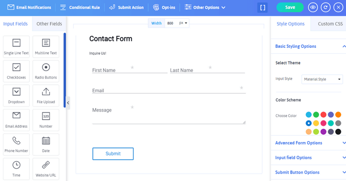
See? Our new word does not insult your intelligence. Simply asking for the most important data will show your audience that you appreciate their time. The shorter the form, the higher the conversion rates.
Even deleting one form field can result in a 50 percent boost in submissions. Although it may be tempting to provide optional fields in the hopes of getting more information, such seemingly benign boxes can obstruct your submission goals.
Your users will be more likely to reach the desired submit button if your form is tidy and straightforward to fill out. Assist folks who use screen readers and assistive technology by properly labeling each field.
Any fields that need more explanation can have descriptions or instructive wording added to them. Provide customized error messages as a precaution, directing the user to the proper resources for resolving any problems.
2. Set Easy to Fill Multi-page Forms
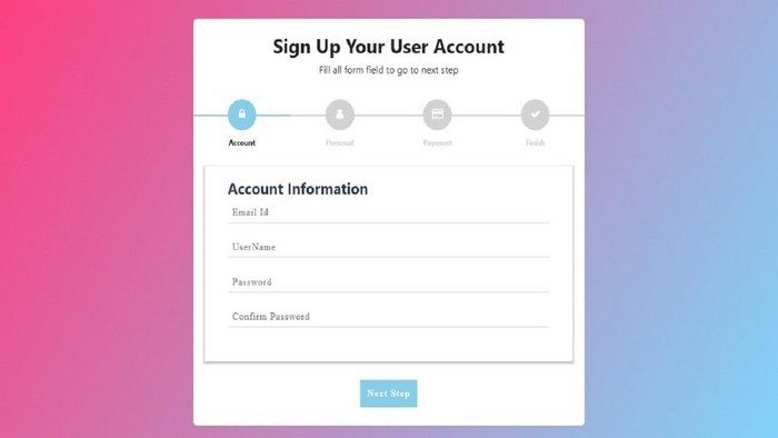
If you were rolling your eyes at the first tip, we have some good news for you. Complex forms are occasionally required. Splitting your form into logical components and separating them onto separate pages will make your users feel more at ease with the process in these situations.
Some forms are more suited to the multi-page form format than others. Consider the forms below:
- Forms with Payment option.
- Job Application Forms.
- Event or Concert Registration Form.
- Registration Forms.
- Multi Question Survey Forms.
Multi-page forms can improve accessibility because of their brevity and clarity. The World Wide Web Consortium (W3C) recommends breaking down your form into logical sections or process phases. In an eCommerce form, billing information, for example, might be stored on a different page from shipping information.
Education would be listed on one page of an employment application, followed by professional experience fields on the next page.
With a tool like ARForms, multi-page best practices like giving instructions on each page and using a progress bar or progress stages to assist visitors in tracking their progress toward completion are simple to implement.
Users of your forms will be less annoyed and have a better overall experience if you employ these visual clues.
3. More functional Forms Using Conditional Logics
Conditional logic improves the usability of forms by presenting only relevant fields to the user. In other words, conditional logic is the technology that allows you to change your form fields based on the user’s input in a previous phase.
With conditional logic included in every license, ARForms puts that technology at your fingertips.
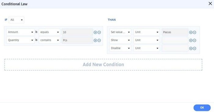
Assume you want to give every one of your event attendees a free swag item. You provide the user the option of selecting a water bottle, hat, or t-shirt from a dropdown menu.
Some items, such as water bottles and headwear, may not require any more information, allowing the customer to skip straight to the “Register” option.
You can, however, use conditional logic to add a new “t-shirt size” column for everyone who selects “t-shirt.” Your WordPress forms should not be a one-size-fits-all solution.
Conditional logic allows you to tailor your form confirmations and auto-replies. For example, if you’re setting up a contribution form, you might need to send users to multiple confirmation pages depending on the size of their donation.
Alternatively, you may want to send a second confirmation email based on the facility a consumer picks on your reservation form. This customization, and much more, can be aided by conditional logic.
4. Flexible Form Process for Users to Pause and Resume Form Filling
Allowing your users to take a break may seem counterintuitive, but it may make a significant difference, particularly on more extended forms.
By selecting the Save and Continue option, you can easily allow your users to save their progress and continue filling out your form at a later time. It prevents them from completely disconnecting when faced with a distraction.
For lengthy forms, Save and Continue is a great tool, especially if your users may need to obtain more papers or information. Since when did you last apply for a job?
You may need to double-check your employment dates or look up a reference’s contact information. Maybe you need to look up that obscure qualification you got on the internet five years ago and proudly posted on your LinkedIn page.
You can create a personalized link and even give it to your users so that they can return when they’re ready to save and continue.
5. Build Clear and Compelling CTA
Keep in mind that a strong user experience revolves around the users’ goals. And, believe it or not, today’s “submit a form” is a misnomer. They were most likely trying to get in touch with someone at your company, sign up for your newsletter, register for an event, buy something, or make a reservation.
By skipping the standard “submit” label on your final form button, you may change the language to speak directly to the user’s intent.
Here Are Some Clear CTA examples to Get More User Engagement:
- Get a Free Quote
- Order Now
- Get Your Free Demo today
- Start Your Free Trial Now
- Try It Now
- Register Now
- Sign Up
- Buy Now
- Get the Guide
- Subscribe Today
- Create Account
A strong and clever call to action will remind your users why they’re filling out the form in the first place and encourage them to complete it. Make sure your form tool lets you change the language and design of the button to grab your audience’s attention and urge them to act.
In Conclusion
Conversion is the most important factor for the sale or targeted action from the user; here, we can consider that the above-given factors are very important for the conversion rates to improve.
We are delighted to share this blog in a relevant manner, show your support, share this article on social media platforms, and comment on any concerns you have in the comment box.
WPBN is curated news aggregator website focusing on trending and hot news from the WordPress community.

