Considering the popularity that WordPress beholds, there’s no denying the fact that the tools to be used over this platform are available in abundance. Right from plugins to themes, you can find a tool for almost everything.
However, amidst the ever-growing list of themes, it’s obviously a bit tedious to finalize the one that has almost all of the required features. Thus, to help you make the finding process more manageable, here’s a review of a fast-loading and free WordPress theme, known as Responsive.

This one is a well-appreciated theme, comprising an array of primary features, competent enough of helping you grow and expand your business tremendously. Now, without further ado, let’s dive deeper and find out more about the advantages that you can avail from this theme.
About The Responsive WordPress Theme
Developed by CyberChimps, the mind behind several exceptional themes, Responsive is available in two different versions, free and pro. So far, more than 50,000 websites have been developed using this specific theme.
Beneficial Features of Responsive WordPress Theme
Here is a list of features that you can expect in this theme:
Element Positioning

Lately, the theme was integrated with new additional features, Element Positioning being one of them. You get to alter the design of blog page elements with the help of drag and drop interface.
For instance, whether you have to change the metadata or do some modifications with the featured image, things have been made pretty effortless for users.
Responsive Design
One of the significant aspects of a theme buying journey is to figure out whether the selected option has a responsive design. After all, it takes merely 50 milliseconds for a visitor to generate an opinion about your website. And, apparently, 57% of users aren’t willing to recommend a site if it has a bad design.
So, overall, you may have a lot to lose. But, with the Responsive WordPress theme, developers have primarily focused on responsiveness. Based on your visitors’ inflow, you can fill up the screen with this theme for up to 960px in width.
Enhanced Typography

Another noteworthy feature of the theme is enhanced customization for font and typography. With the recent update, Responsive lets you update the overall typography for content, including headings and other elements.
This feature will surely help you create a unique, bespoke appearance of your platform, be it a website or a blog.
WooCommerce Design Customization
The responsive WordPress theme provides customizer settings to customize the WooCommerce store design. You can change the structure and colors from settings. It also provides configuration to design sale notification blocks.
Homepage Customization
Moving forward, this theme offers you several options to customize the content of the home page. Along with the text content, you can also customize the image, header, and CTA buttons.
Configuration of Colors

When it comes to customizing the website on your own terms, you may need something extra than settings options, right? Keeping this in mind, Responsive gives control to site administrators like never before! It offers many color options to change link colors, body content colors, button colors, heading colors, and much more.
Ready to Use Websites
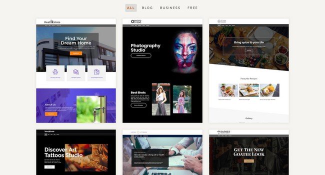
Responsive comprises 10+ ready to use websites, meant for diverse niches altogether. These pre-ready sites can be used if your business belongs to any of the following domains:
- Real Estate
- Photography Studio
- Lifestyle
- Accounting & Taxation
- Food
- Salon
- Construction
- Décor Services
- Medical
- Yoga
- Travel
As far as advanced businesses and professionals are concerned, there are limited ready sites option but CyberChimps is planning to introduce more of them in the future. These ready sites can be imported seamlessly with the Responsive add-on plugin. Keep in mind that you can only import web pages designed with Elementor as the theme currently supports only this one-page builder.
Different Layout Options
When it comes to experimenting with layout options, Responsive allows you to choose the one from a variety of options for blog index page, posts, and other web pages. You can even try different display methods of sidebar too.
Setting Up the Website with Responsive WordPress Theme
Mostly like several other easy-going themes, setting up a website with Responsive is pretty simple as well. You can complete the process within a few simple steps:
- Install the theme and activate it- You can directly install it from admin.
- Install the add-on plugin to import the website, two options to import.
- Now, choose a demo as per the requirement and preference.
- Hit the Import Content button.
Wrapping Up
Undoubtedly, Responsive is one of the well-acknowledged themes available in the directory of WordPress with more than 100,000 active installs. Even users have claimed to have no troubles whatsoever while installing or configuring this theme.
Although the widget system and page layouts are a bit clumsy with different templates and widget areas to track. Responsive is entirely free, extremely customization, and completely quick as well as responsive to fetch you a great deal in business.
All in all, if you’re just starting up and are looking forward to having a simple yet elegant theme, Responsive is the best choice for you, without any second thoughts.
Pioneers of the Responsive WordPress Theme. They started in 2012, and since then, the growth path has been upward. Their quality of themes and top-notch support helps to deliver a premium experience to users.