Everyone strives to make a great first impression; be it with home décor on the guests coming to your house, or with an alluring web design on the visitors clicking on your website. And, why wouldn’t you put in efforts to do so? After all, the first impression is the last one, right?
However, when talking about the online world, a higher conversion rate is what people anticipate in return for an amazing design of the website. It is just the percentage of people who buy something from your website.
When people visit your website, either they do take an action, or they just don’t give a damn about it. In simple words, that’s how you can define conversion rate. And, mind you, if they are not giving a damn about your website or your business, then you are really in trouble.
However, don’t worry if you think that your conversion rate is not quite satisfactory. There are always some ways to make the magic happen. So, below-mentioned are some essential points that you should ponder upon if you want a substantial website conversion rate.
Stunning Web Design
Although there are several ways to procure a high website conversion rate, however, the foremost point that can trigger everything for you is to have a stunning design. There are several business owners out there, who own a website with a completely different design than that of their business. And the result? Nothing but they end up cribbing on bad conversion rate.
To instill trustworthiness and reliability in your customers’ hearts and minds, you must ensure that your website has a professional and stable design.
Devoid of excessive animation and bold colors, your website should be simple and elegant. Don’t give a chance to your visitors to move away from your website the moment they try to scrutinize the home page. That can lead to a lot of troubles for you.
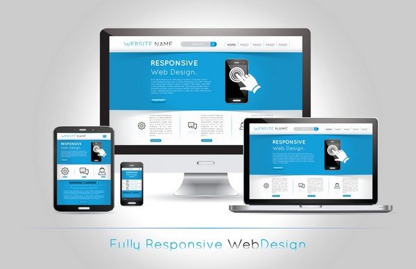
Responsive Theme

In the present scenario, how many people, do you think, use mobile phones more than desktops or other devices? Even if you don’t look at the statistics, you can still be sure of the fact that the majority will win here.
So, since you know that most of your audience will be opening the website on their phones, then you must make sure the theme is mobile-friendly and responsive enough to let that happen.
Moreover, also look at the loading speed and time of the website. No customer is going to wait till the eternity for your website to load so they would make a purchase.
Once you have made sure that your theme is not causing any problems, whatsoever, with the website, you will surely experience a better conversion rate than before.
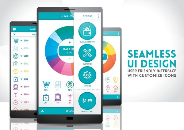
Focus on UI

User Interface, also known as UI, is one of the most important elements that you must consider so as to increase the conversion rate. It is nothing but looks of the website. And, to attract more and more customers and to make navigating easier for them, make sure the UI of your website is as smooth and plain as possible.
Undeniably, a well-designed user interface creates such an experience for users that they not only appreciate but also keep safe at the back of their mind.
This, in return, increases the chances of them returning to your website and being your loyal customers forever. At the end of the day, it’s all in the experience.
Work on Website Navigation
Moving further, website navigation is another important feature that matters a lot in your conversion rate. Whether it is about a user finding what he/she is looking for, or helping rankings of your search engine, a great navigation is helpful in several ways. Anyhow, since you are concentrating on providing a better experience for your users, you must not neglect the navigation part.
Also, try using descriptive navigation as much as possible. Help your users to go through the website seamlessly. It’s only a few clicks that they are going to make, and you should always keep that in mind.
Don’t use jargon words or website lingo. Be clever. Your users may not be aware of the words that might be common to you. So, keep it as simple as you can.
Color Coordination
While different color combinations may look appealing to your eyes, but it is not necessary that it will attract your audience as well. Try out an amalgamation of a couple of colors may turn out to be intriguing but making the entire website a palate is a strict no. Use two or three colors and use them throughout your website.
Maintaining the uniformity is another thing that you must look at. The colors that you have put on your homepage, use the same set to decorate your call-to-action page with.
Not just that, but also make sure that the colors you are selecting are not piercing in the eyes but soothing them. Don’t come up with vibrant and striking colors, on the contrary, keep them soothing and light.
Testimonials
If you are a newbie in the game, it will take a bit of time before your customers would start realizing your worth. Don’t expect them to have a eureka moment and start believing your business with closed eyes. To obtain their trust, you would have to put in efforts. And, one of the best ways of doing so is by showing up testimonials.
You can use this proof to entice your audience and charm enough so that they signup your newsletters, buy your products, or download your e-book without thinking twice.
However, don’t commit the mistake of creating a whole new testimonial page. Wait, if you were going to do that, it’s not worth it. Nobody is going to click on it just to find out what a bunch of people think about your business. On the other hand, you can scatter these testimonials throughout the website to attract your visitors on the go.
Internal Linking
Internal linking is not just important for your users but search engine ranking as well. You wouldn’t want your visitors to hit a dead point while going through your website. Surely, they are not going to like it anyway.
There are several ways to keep them hooked. Apart from just linking pages with each other, you can even put a call to action buttons on important pages. It can be a contact form, an e-book to download, a channel to subscribe, or anything.
But, make sure that your entire website is interlinked with each other. It will surely fetch you some great results and higher conversion percentage.
About Us Page
Upon clicking on your website, your visitors would be much eager to know more about you and your company. Any amount of information would be less unless you are not giving them what they are looking for. Being a new one into the business, nobody, genuinely interested, would leave your website before hitting that About Us page mentioned on the top.
While buying products or services, people would want to know more about your history, your mission, your vision, and all the other things that would be covering up about you.
And, to keep them hooked up, you would have to be subtle and on-point. Mention everything about you that you can. After all, they just want to make sure whether you are reliable enough or not. They are spending their money, it would obviously mean something to them.
Email Signups

Last but definitely not the least, email signups hold great importance in increasing your conversion rates as well. Generally speaking, an attractive email signup form comprises three main P’s. And they are Prominence, Proof, and Promise.
When it comes to designing, make your form visually prominent and attractive. That’s one thing that may compel your readers to signup for your form. And then, don’t forget to put in a proof into it. It can be anything, right from a realization of their mistake to a fact that they never wanted to admit. Once you have put a proof into your email signup form, you are really done with it. And, lastly, promise them something. Assure them that you are going to solve their problem and that too, for their betterment.
Keep it simple and obvious. Don’t bait them. It is always good to have a small number of genuine followers than a baited herd.
Wrapping Up
Improving your website conversion may not seem to be a tougher task, after all of these aforementioned points, is it? If you are starting up, it is okay to feel overwhelmed, but the one thing that you must keep holding onto is patience. The process does not happen overnight, but it takes time. For some, it may even take years altogether.
But, eventually, with everything correctly followed, you will reach there very soon. So, follow these steps and create such a web design that your visitors would not resist but bookmarking your website and buying stuff from you.
Author Bio
Ananthakrishnan is a Digital Marketing guy for Greedeals.com. He has a keen interest in SEO and Web Design. When he is not working you can find him at his house, playing video games.
WPBN is curated news aggregator website focusing on trending and hot news from the WordPress community.


