In the early days of the Internet, the only web fonts that were reliable were standard “web-safe” fonts, such as Arial, Helvetica, Verdana, Trebuchet and Times New Roman. Also called “fallback fonts,” they were considered safe because the web page drew on the fonts on the user’s hard drive and almost all computers had those fonts installed.
But they severely limited the choices available to designers and made text on web pages look pretty much the same on all sites.
Today, however, there are plenty of emerging typography trends and hundreds of web fonts are available for use on websites. Many are free fonts and can be uploaded into a web design, from where they are displayed on a user’s screen. Some web design programs enable you to use these free fonts in your layout with only a few clicks of the mouse.
As a result, these fonts no longer have to be available on the user’s hard drive to display correctly, providing designers with the wide variety of font options that have been available to print designers for generations.
These new font options should be used judicially, however, to gain the most impact from them.
Here are 10 tips to help you use these new font options effectively on your website.
Tips for Using New Fonts on Your Website

Give Your Site a Distinctive Appearance
Select the best fonts for use on your site that will help to make your site distinctive. On its site, the New York Times uses fonts, particularly for its headlines, that are similar to those in its newspaper. The Wall Street Journal and many other newspapers do the same. In that way, regular readers recognize the look of those newspapers even should the type appear on other sites.
Be careful not to select fonts that appear as beautiful fonts but are difficult to read. A wide variety of readable fonts are available for your basic choices.
Use a Sans Serif Face for Headlines
The standard newspaper principle is to use a sans serif face (that is, a font without strokes at the end of its letters) for headlines. These fonts — Arial and Helvetica are web-safe examples — are considered more modern, clean looking and appear more authoritative.
This principle works well on the web, too, and provides you with a wide variety of choices for your headlines.
Consider Narrow Typefaces for Headlines
Selecting a narrow typeface, such as a condensed font, for headlines can be useful. They are ideal for enabling you to fit longer headlines on one line. Make sure, however, that the font is easy to read.
Use a Serif Face for Text
A serif face, such as Times New Roman, is considered to be easier to read than a sans serif font. A major reason is that the text in most books, newspapers, and magazines are set in serif type. Users have become accustomed to the fonts and tend to read such fonts more quickly than text set in sans serif.
It is a good idea, therefore, to use a serif font for your text.
Use Only a Few Fonts on Your Site
Avoid the temptation to scatter cool fonts freely all around your site. Doing so will give the appearance of a haphazard, thrown-together site by a designer who is trying to show how many fonts can be used.
Use only one or two fonts for all headlines, for example. You might want to differentiate between headlines that contain solid statements and those that are a little playful. Much depends on the nature of your site. The same principle should be true for the text.
Be Consistent Throughout Your Site
Once you have selected a font for your headlines, for example, use it on all headlines throughout your site. That will provide a distinctive look with which users can identify.
The only exception should be if you wish to select a different font for articles that have a more playful or a more humorous approach.
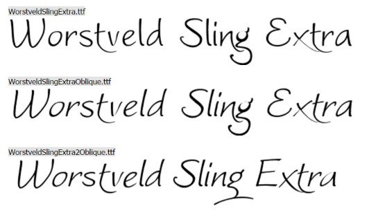
When to Use Handwritten Fonts

You might use handwritten fonts in letters that you post on your site, for example, to give that personal look to the text. If you have only two or three letters, consider using different fonts for each.
Avoid using handwritten fonts for headlines. They should be used only in text and only in special circumstances.
When to Use Script Fonts
Script fonts are a great choice for special documents, such as for awards or when you want to imitate historical documents. They can occasionally be used on headlines should you wish to achieve a special effect.
Use Fonts for Special Effects
On occasion, you might want to use cool fonts and beautiful fonts for special effects. You will find a variety of such fonts available. Including those that evoke memories of the wild west days, shattered fonts that an illustrate something that is broken. Fonts that look like old typewritten text, Old English typefaces, and so on.
Black on White Works Best
Generally, for most articles, you should select black type on a light colored background, no matter the font that you use. Be careful with using colored text, particularly on a dark background where the contrast is low and makes the text much harder to read. Also, using white text on black might be a strong contrast and a great design feature. But it generally is much harder to read.
In all cases, readability should take precedence over design.
Final Thoughts
A font can be a completely subjective aspect of a design. But whenever finalizing one, make sure you keep in mind all the above tips and pick the best fonts.
Susmita is an engineer, a writer, and a dancer – not necessarily in that order! Ever since she discovered WordPress, she has not ceased to be amazed by how this community-driven platform brings people together – in more ways than one. And yes, she loves binge-watching movies!


